LensWork Online
I'm honoured that my wood nymph folio set is being featured in the Readers' Gallery of the LensWork Online site, alongside works and portfolios by other very talented photographers. LensWork is a print magazine and online environment filled with resources and musings prepared by Brooks Jensen, the editor/publisher and art photographer. I have been following the iPad version of the LensWork magazine, as well as Brooks' regular podcasts (over 900 of them!) and the Kokoro online publication of his personal art photography work. His musings are succinct and most inspiring, sprinkled with an oriental sensibility with which I find great resonance.
You can view the PDF that was posted on LensWork Online.
To find out more about LensWork and Brooks Jensen's art photography:
LensWork: http://www.lenswork.com
Brooks Jensen's personal art photography website: www.brooksjensenarts.com
Tonality and selective colour
All my life, I have been photographing in colour, often using black, orange, reds and yellows. I guess I enjoy the drama of colours against a dark background.
However, for a while now, I have been developing a greater appreciation of monochrome, not necessarily black and white, but warm tones such as sepia, reminiscent of the pictorialist style. I've discovered that the range and contrasts in tonality open a whole new way of looking at things. However, I do like colour and would never be able to completely eliminate it from my work. What I like even more is the idea that I can introduce colour in a monochrome piece by selecting a specific area of the image I wish to highlight in its original colour. This adds the necessary punch or splash of colour to a warm toned image and draws the eye immediately to that area of the photo.
I explored various applications such as Snapseed and Tonality which provided some degree of success with warm tone filters and selective colouring.
However, the best way I have found to do this to my personal liking is with Photoshop, by adding B&W (with a warm tone profile) and Selective Colour adjustment layers to the original colour photograph.
However, for a while now, I have been developing a greater appreciation of monochrome, not necessarily black and white, but warm tones such as sepia, reminiscent of the pictorialist style. I've discovered that the range and contrasts in tonality open a whole new way of looking at things. However, I do like colour and would never be able to completely eliminate it from my work. What I like even more is the idea that I can introduce colour in a monochrome piece by selecting a specific area of the image I wish to highlight in its original colour. This adds the necessary punch or splash of colour to a warm toned image and draws the eye immediately to that area of the photo.
I explored various applications such as Snapseed and Tonality which provided some degree of success with warm tone filters and selective colouring.
![]() |
Colour photo in Photoshop with B&W and Hue/Saturation adjustment layers |
![]() |
Various filters in Tonality |
Labels:
monochrome,
photography,
pictorialism,
selective colour,
warm tones
wood nymph process images
wood nymph folio book set
wood nymph is about an artist and a wood nymph. It evokes struggle, transformation and rebirth through a deep longing for change, tempered by a strong determination to preserve an existing order. It illustrates a bond between nature and human.
The folio book set comprises handmade components that engage the reader in quietly discovering the spirit of the woodland through sight and touch.
All components are enclosed in a 5" x 5" x 1” paper case with four folding flaps and a sliding belly band.
A four-page colophon, assembled flutter book style (Japanese sempuyo), contains the artist's preface and details on the paper, printing, editioning and copyright.
A second flutter booklet features a freestyle twenty-two-page poem; a handmade caddisfly larva case, constructed of leaf, twig and other materials, serves as a bookmark.
The reader can display and view on a small easel stand a series of nine photographic archival pigment ink prints on paper, assembled in a folder. In addition, a translucent beeswax-infused photographic print on Japanese unryu washi paper waits to capture ambient light.
Sample pages:
![]() |
Colophon, pp 1-2 |
![]() | |||||||
Poem, pp 6-7 |
This is an open edition; each set is signed and numbered by the artist.
The book and photo print as experiential objects
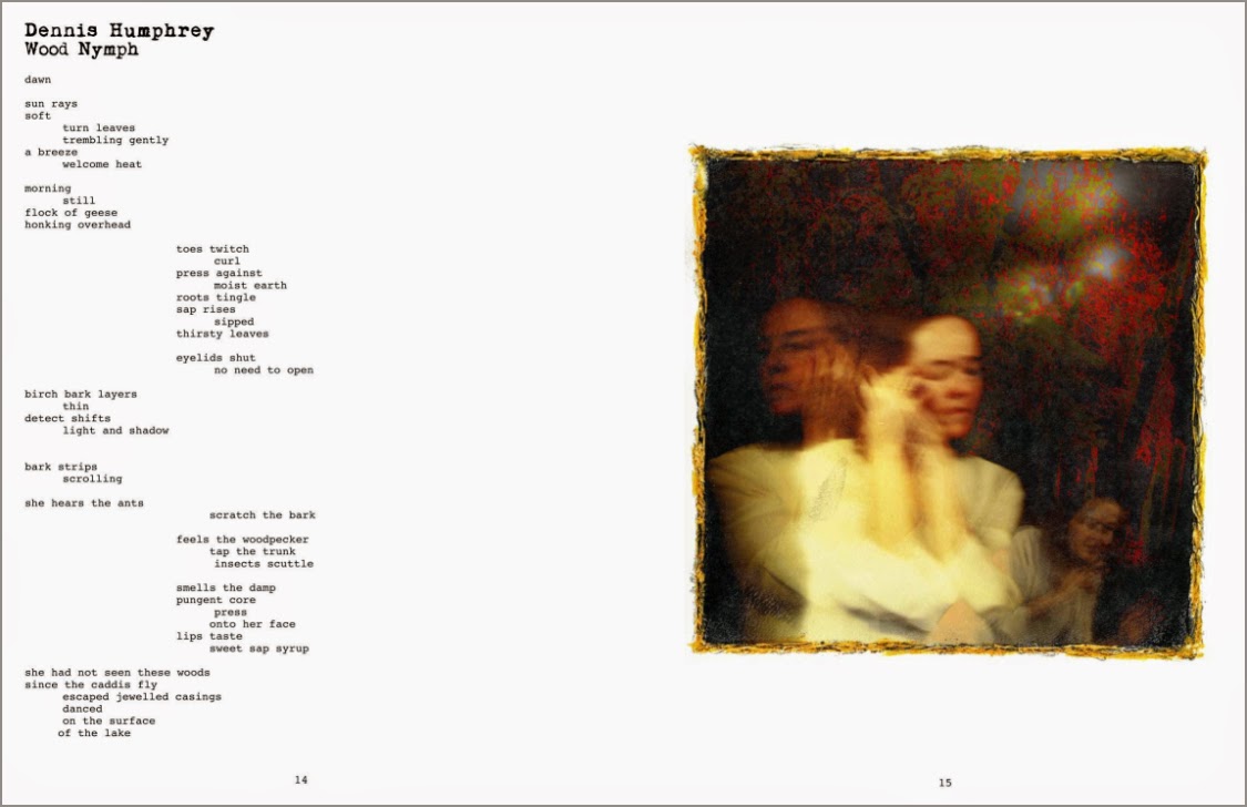
I've just completed a handmade folio edition of wood nymph.
I'm interested in the physicality of books and photographs and in moving them off the wall, shelf and screen into one's hands.
For me, the handcrafted artist book is a 'living' object, offered by the artist-writer to the reader in order to be felt, touched and viewed. It can be an experience whereby one discovers new layers of meaning while engaging physically with the content, the format and the components.
The same applies to a photographic print, often trapped behind a mat and glass, contained within a frame and nailed to a wall—out of reach of the viewer. I have explored various ways of making my photographic prints more tactile and visual, by printing on Japanese washi paper, infusing them with wax, or creating mixed media encaustic images. These translucent pieces capture light and can be viewed suspended, hung away from the wall. They can be touched since they are not confined to frames or trapped behind glass. The pieces can also move with air currents and change as the ambient light does.
The issue, however, especially if one is not really into gallery showings, is what to do with the inventory of prints one produces, other than give them away to friends?
For me, one answer is to create small photographic prints (e.g., 5" x 5"), with or without encaustic. These less expensive images can be part of an artist's book, shared with and touched by friends and colleagues (e.g., ATC style). One can provide a small simple easel to display these miniature pieces.
My recent wood nymph folio case is one example of such a multi sensory experiential piece.
Mushi no Hoshi - Space Insect
Felt very privileged on March 21 to attend Darakudakan's butoh performance of Mushi no Hoshi with J at the Vancouver Playhouse. It was very dramatic and professionally presented. This was their only stop in North America. Even in Tokyo, where they live and work, it's difficult to take in one of their shows since they are few and far between.
The title, Mushi no hoshi, was translated as "Space Insects", but I've seen it translated for their Paris performance as "Planet of Insects," which may be more accurate. The 30-year-old dance troupe gave it their all, with no intermission and several encores spurred on by a very enthusiastic crowd.
...With 22 surreal, shape-shifting dancers, other-worldly costumes and body-paint, and a spectacular set, Dairakudakan exemplifies the transformative power of butoh through its imaginative blend of theatre and dance. Mushi no Hoshi – Space Insect was choreographed by artistic director, Akaji Maro... ~ Vancouver International Dance Festival
![]() |
Poster featuring Akaji Maro |
Adore Noir & Adore Chroma magazines
Cover images © Adore Noir & Adore Chroma respectively
Adore Noir and Adore Chroma are (PDF) fine art photography magazines published in Vancouver, Canada.
Adore Noir celebrates works in black and white photography (23 issues to date), whereas the recently introduced Adore Chroma (4 issues to date) focuses on fine art colour photography. Each issue features several international artist portfolios (each including photos and an interview), as well as articles on various subjects of interest to the fine art community.
Adore Noir: http://www.adorenoir.com
Adore Chroma: http://www.adorechroma.com
Great reads, with an interesting diversity of artists and short articles. The subscription price to each is very affordable.
Lauren E. Simonutti's books
Lauren E. Simonutti was a gifted and prolific American fine art photographer. She passed away in 2012 at the age of 44. The sensitive and soft harshness of her images echoed her constant turmoils in the face of mental illness. She lived the latter part of her life inside her old house, capturing images that recorded her inner self. She had a very active presence online on deviantART, flickr and blogger, among others.
Two books on her art are available on blurb:
You can read an earlier interview with Lauren Simonutti by Susan Burnstine on her blog, underexposed:
http://blog.susanburnstine.com/post/21902234398
Two books on her art are available on blurb:
"Over three and one half years I have spent alone amidst these 8 rooms, 7 mirrors, 6 clocks, 2 minds and 199 panes of glass. And this is what I saw here. This is what I learned." ~ Lauren E. Simonutti
The Devil's Alphabet, 2011 Lauren E. Simonutti Cover image © Lauren E. Simonutti |
http://blog.susanburnstine.com/post/21902234398
Susan Burnstine's 'Within Shadows'
Image © Susan Burnstine |
Susan Burnstine is a contemporary American fine art photographer. Her personal style of black and white photography echoes qualities of the late 19th/early 20th century Pictorialist movement. Through ethereal, out-of-focus images, Susan represents moods and elements of her dreams with cameras she built from salvaged lenses and other camera parts.
Her 2011 hardcover book, Within Shadows, contains 100 pages with 45 duotones, accompanied with text written by George Slade, Russell Joslin, Susan Burnstine and Susan Spiritus.
Find more information on her website: http://www.susanburnstine.com/books.htm
You can read an interesting interview with Susan by Jonathan Burnstine on aPhotoEditor:
http://www.aphotoeditor.com/2014/06/11/susan-burnstine-interview/
Eyemazing Editions 2014 Annual Pictorial
The Eyemazing Editions' 2014 Annual Pictorial is out. Edited and published in The Netherlands by Eyemazing Susan (Susan Zadeh), this is a large format hardcover book, filled with fascinating contemporary fine art photography by 42 international artists.
Check out the EYEMAZING EDITIONS website: http://eyemazingeditions.com
Echoes of Bluemars
For years, I listened to the Bluemars ambient music streams on the Internet, at night before or during sleep, or while writing or working in the studio. There were three separate streams: Bluemars (Music for the Space Traveller), Cryosleep (Zero Beat Guaranteed) and Voices from Within (Words From Beyond). Cryosleep especially provided the ambience for me to enter into a non-intrusive other-worldly realm where my mind seemed to float, suspended, as I savoured the lightness and textures of the sonic pulses.
On and off over the years, Bluemars suddenly stopped transmitting in 2013. However, in late 2013, overrider created Echoes of Bluemars; as curator, he has made certain that the revived fleet of streams remains faithful to its origins.
The streams are definitely worth exploring.
There is also an Echoes of Bluemars Facebook page, if you're interested.
Enjoy!
On and off over the years, Bluemars suddenly stopped transmitting in 2013. However, in late 2013, overrider created Echoes of Bluemars; as curator, he has made certain that the revived fleet of streams remains faithful to its origins.
"In attempts to reestablish communication with the lost Bluemars fleet, an echo of past transmissions was found. Retransmitting signals from years ago, these echoes give us a glimpse into the past."
![]() |
http://echoesofbluemars.org |
The streams are definitely worth exploring.
There is also an Echoes of Bluemars Facebook page, if you're interested.
Enjoy!
Latent Image magazine
Five full pages, including an excerpt from my wood nymph poem and several images, were published in Issue No. 4 (Fall 2014) of Latent Image, an online magazine edited/published by Allison White and Nicole Langdon-Davies from Vancouver.
Their 'zine is "a story of images and words, juxtaposed." The online digital version is free to view; you can also purchase a hardcopy version.
![]() |
2 of 5 full pages |
Subscribe to:
Posts (Atom)